
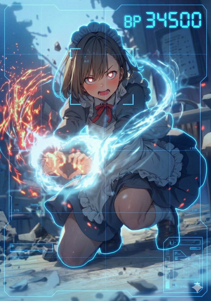
HUD battle power overlay for any character image
Use blue HUD color. task: "edit-image: add full-screen analysis HUD overlay only"
Prompt Library
Curated image, video and web design prompts from creators around the world. Copy any prompt, swap the subject or style, and generate with the latest models.
4,387 prompts · Updated daily · 100% free
275 prompts
Use blue HUD color. task: "edit-image: add full-screen analysis HUD overlay only"
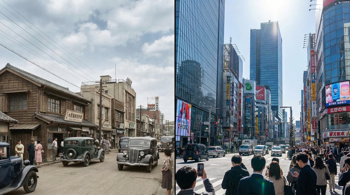
Generate a single photorealistic 16:9 image and split its composition into left and right halves. On each side, depict the same place, [LOCATION_NAME: {argument name="location_name_en" default="(any location)"}], at different eras. Left side: {argument name="left_year_en" default="(any year)"} · {argument name="left_time_en" default="(time)"} Right side: {argument name="right_year_en" default="(any year)"} · {argument name="right_time_en" default="(time)"} Keep the camera position exactly the same and use the following coordinates: [LATITUDE,LONGITUDE: {argument name="coordinates_en" default="(latitude and longitude of any place)"}] Do not include any text in the image (years, labels, watermarks, etc.). Do not specify detailed visuals. Leave all aspects such as architecture, light, cars, people, signs, materials, atmosphere, and composition up to Nano Banana Pro. Each era should feel natural and together form a side-by-side time comparison image within a single 16:9 frame. --ar 16:9 --stylize 800 --v 6
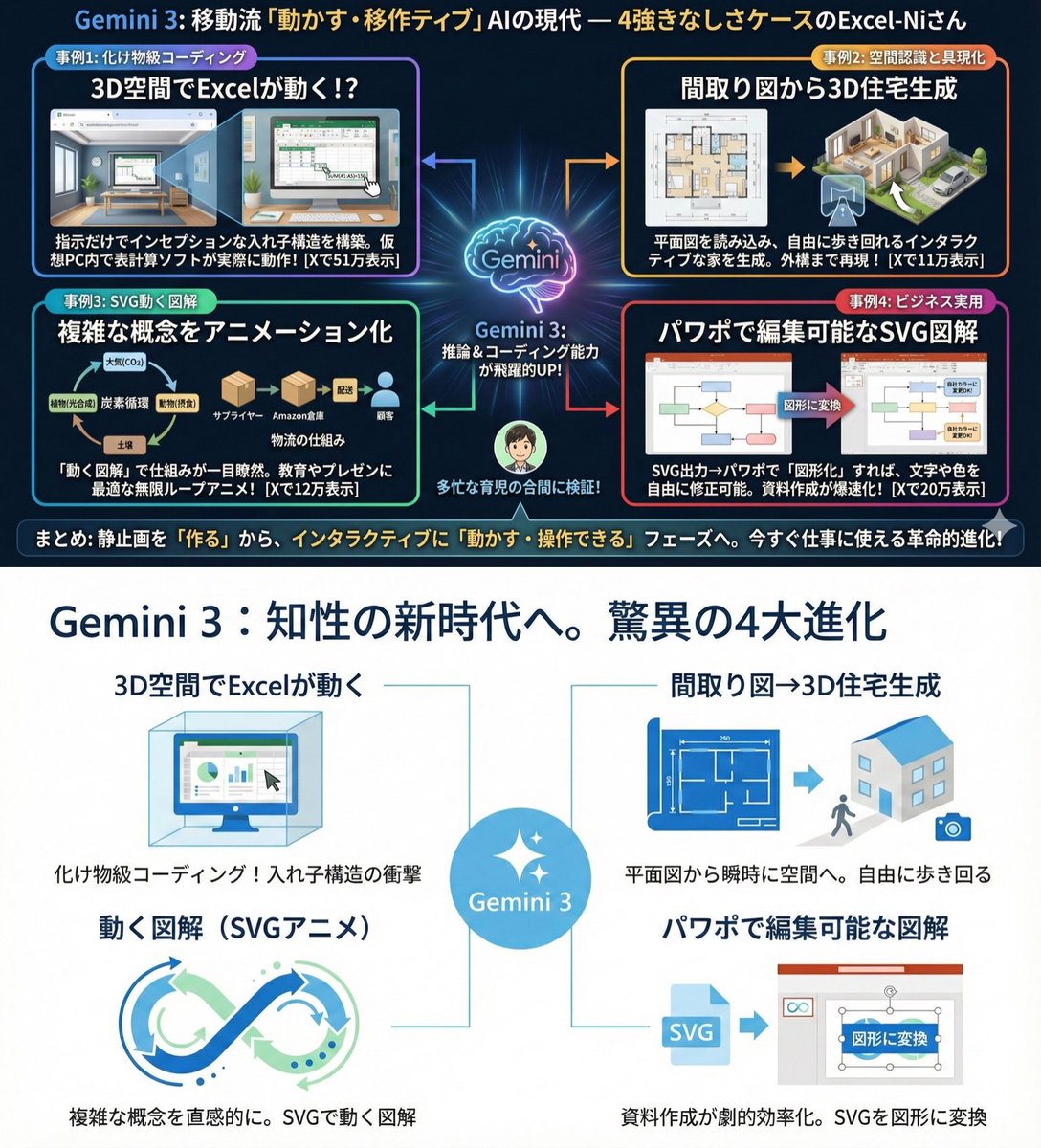
Use extremely little text and focus on graphical expression. Suppress Japanese character garbling. Use Hiragino Gothic as the main font. Keep the content as is, but make the colors and design similar to Microsoft 365. Use a flat and simple design.
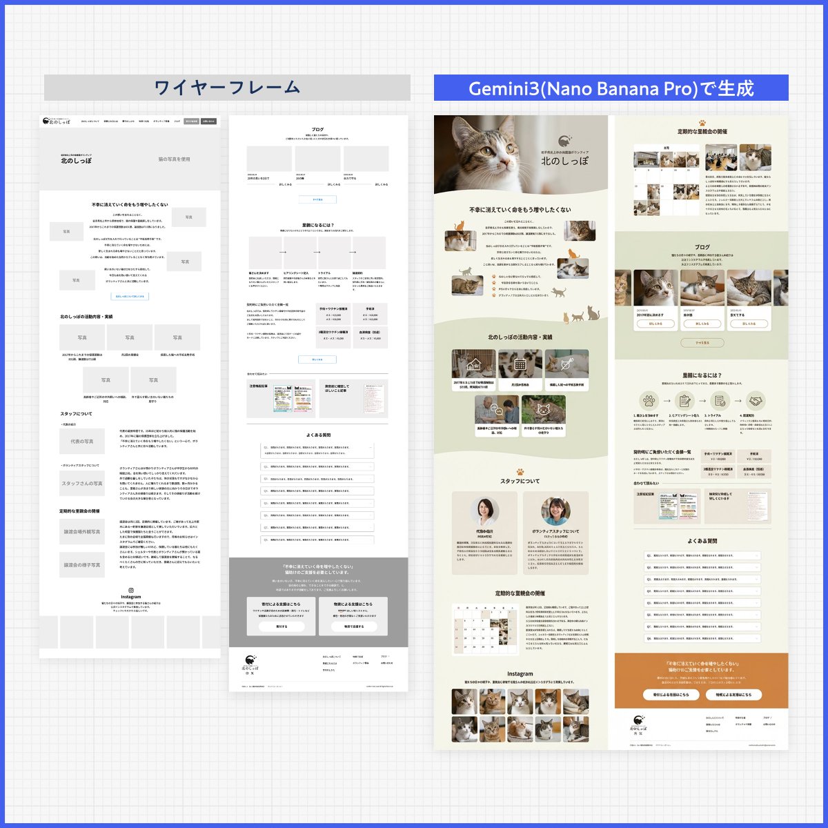
Please create a design based on the text in the reference image. Ignore the layout. Design it like a professional designer would. Create a clean, well‑organized design with a beautiful flow.
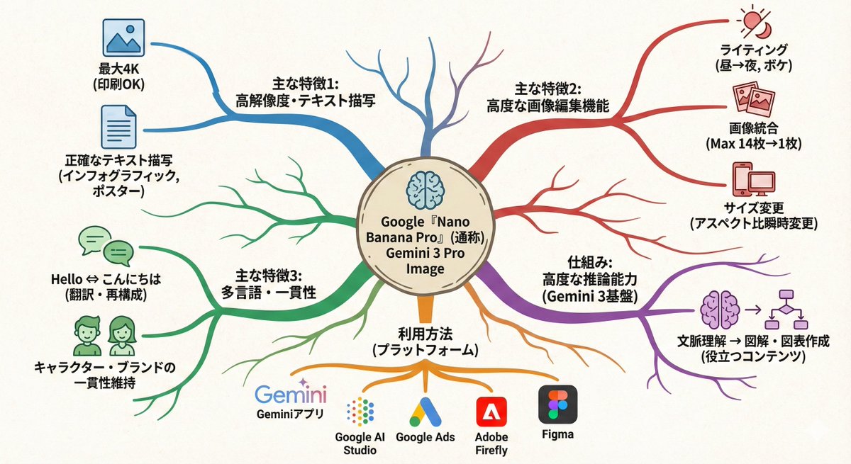
Turn this text into a map that expands outward from the center. Key points: - Put the main theme in the middle - Arrange related elements as branching nodes - Use color coding to separate categories - Add simple icons - Use an organic layout Make it feel like my thoughts are being organized.
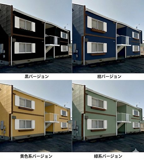
So that I can do a paint simulation, make a single image that lets me compare several different patterns.

Turn the advantages of investing in Vietnam into a single slide.
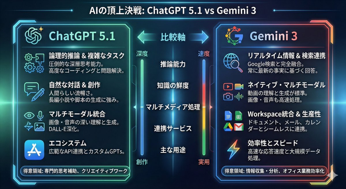
Turn the comparison between {argument name="model_1_en" default="ChatGPT 5.1"} and {argument name="model_2_en" default="Gemini 3"} into an infographic.
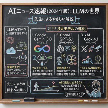
Using the following content, summarize the news in a chalkboard-style, hand‑written look, and break it down with diagrams and easy‑to‑understand expressions as if a teacher had written it. —- Search results from Grok

Completely recreate the uploaded person. Make it a header image for a note article where that person introduces “Nano Banana Pro”. Aspect ratio: horizontal 16:9. Style and colors: simple, hand-drawn style, italic, with a blue and green gradient. Title text: “In-depth explanation of Google’s new AI ‘Nano Banana Pro’”.

Generate a map of Germany in watercolor style, on which all federal states are labeled in ballpoint pen.
Some prompts are collected from creators on X. Copyright belongs to the original authors.